Tuesday, 24 August 2010
Tuesday 17 August - More Greek
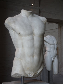
So Tuesday and back to Plan A for Monday, the two main archaeological museums in Munich which face each other in very grand classical severity, the Staatliche Antikensammlungen and the Glyptothek, the latter being a sculpture gallery – real thing now not copies – and the former mostly pots and jewellery. The jewellery is pretty amazing, just not something we are perhaps as used to looking at as the classical statues or ceramics.
The Glyptothek is one of my favourite museums. Both of these museums are a lot lot smaller than their grand facades would suggest which means one doesn’t feel tired even if one looks at everything. And the Glyptothek, because it isn’t crowded with objects, or with information, or a fussy background interior, just leaves you enjoying the art. And at least to me, just enjoying the objects rather than considering all the historical contexts is what its all about.
The simplicity of the buildings is something to which we owe war-time bombing. One of the extraordinary things about Munich is to realise just how much has been restored after the war, and how well it has been done. While I feel the British mentality would have been more, "oh good, let’s take the opportunity to bulldoze this old building and we can stick up a nice featureless modern block", here it is all meticulous restoration. But in the Glyptothek it’s a sort of half job as it has a perfect classical exterior, but the interiors have been left as bare brick. And so suitably austere. And yes I know the classical statues would originally have been gaudily painted, but I just like the austere appearance.
And then to the Brandhorst, the newly opened modern art gallery. Here the audioguide should be useful again in trying to understand what one is looking at. But as is common with modern art, commentators struggle to make any sense either. Often they talk about the ambiguity of the work, or the expressions. Is the person laughing or crying, etc. They don’t tend to go for the obvious answer – the artist was never very good at drawing. One commentary finished to the effect that "the viewer cannot help but be moved by the canvas”. Well misplaced confidence in the viewer I am afraid, or at least this viewer. I couldn’t have been less moved by Cy Twombly’s scribbling if I was actually unconscious.
Subscribe to:
Post Comments (Atom)


No comments:
Post a Comment