And its sheer size is undoubtedly impressive. And its child friendly so families like it.
So why do I say its not very good? Well its not the art work (well it is, but I shall come to that later). Its the building as a gallery. The trouble is that there really isn't much gallery space for its enormous footprint. Ok, the main turbine room is huge and therefore can take the odd vast installation (which it doesn't have at the moment).
But at present it just has two floors of permanent galleries stuck up one side of this vast edifice, plus another floor of exhibition space. The rest of the floors are taken up with shops and restaurants. Basically, there is a huge waste of space. Having been to modern art galleries in Munich and Lisbon relatively recently, its not difficult to see the problem. They were purpose built. And surely if anything could do with a modern building its a modern art gallery. One can't grumble too much with the conversion, its just that it was never a suitable building in the first place for a gallery. I am not really sure what it was suitable for really. A source for a large number of recycled bricks perhaps? Not every building needs to be retained. This isn't decorative and was never meant to be.
As for the contents, well there are some bits of modern art I am very fond of. Pop art,
impressionism, some cubism
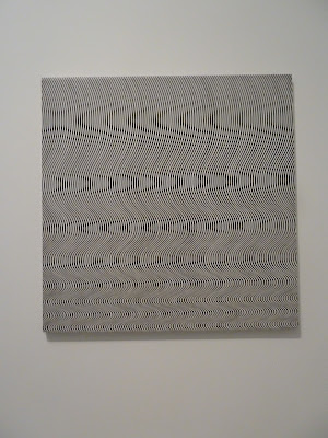
the Op art of Bridget Riley for example.
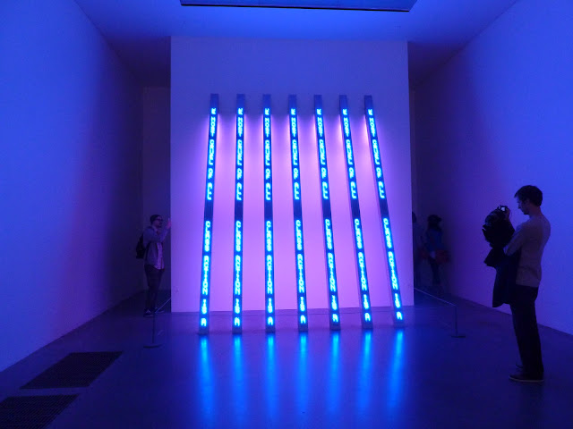
But when it comes to conceptual art, I am afraid frankly the concepts are pretty lame. Its too easy to take the mick, but that's not to say there is anything wrong in doing so. So when you see a mirror on the wall with a description telling you that it challenges your perception of painting, I feel like shouting "No it bloody doesn't, its just a bloody mirror!" My perception of painting isn't challenged every morning when I shave. You know you are in for garbage when labels tell you the artist is "challenging your perception", or is "exploring" something or worse still, is "interested in exploring" something. In all cases its a combination of utterly banal thought with utterly banal subject product.
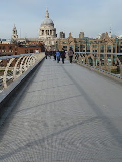
Rant over. But you do get some good views though.


No comments:
Post a Comment