Now there are essentially two sites for this little jamboree. One is in Giardini Publici and this contains the various national pavilions. Imagine an artistic equivalent of the Eurovision song contest. Each country has its own pavilion to showcase the "best" of its contemporary artists. The Park contains most of these, but there isn't enough space for every country to have its own pavilion (they are permanent structures which have been added to over the years,) so there are also quite a few "pavilions" scattered in empty buildings throughout the city.
The second is an International Exhibition with one curator picking stuff from around the world. This is held in the old dockyards, the Arsenale. More of that later. First up the pavilions in the park. I should add this is not a representative view of the exhibits as a lot of the are short films. Video seems very popular. They are however, uniformly tedious to watch. Imagine the world's worst imaginable film-makers. If they can call it a video installation it is suddenly ok to be badly shot and stultifyingly boring.
So, first up, I think this was the Swiss Pavilion. An artist who basically creates squashed musical instruments. Not seen anyone try this before. Probably because as a concept it isn't a good or interesting one.
The Russian Pavilion is one of the grandest structures. But the contents were disappointing in the extreme. Felt like some art students who were too clever for their own good. Basically there were two "exhibits". One was golden shower (no, not that sort of golden shower) - a shower by which coins were showered through a hole into a spot where you were given umbrellas in case they fell on your head.
The second was just a young bloke sitting under the roof cracking nuts and dropping the shells into a neat heap below. Yep, that was it.
 |
| The shower-head |
Korean Pavilion
German pavilion. Very imposing, classical, severe. Crap inside.
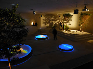
Now sadly I cannot recall which pavilion this was, perhaps Canadian. Sad, as it was one of the most interesting and watchable
Above and below were the same physical tableaux, but with alternative lighting.
The British Pavilion. Almost made me proud to be British, just because it was a bit more interesting than the competition, particularly the huge murals
The French Pavion - attractive building, but while the construction made of bar stools was ingenious, interesting it was not.
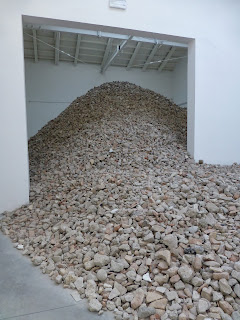
This I think was the Australian pavilion. Above almost any other, was difficult to tell whether one was looking at exhibits or it was the detritus left after something had been on. But no, what you see were exhibits. Underwhelmed
This was one of the Scandinavian Pavilions. the mirrored surface outside was more entertaining than the contents, although these photos make the interior look better than it was.
The Hungarian Pavilion - probably top building
Art out of telephone books. Quirky
Now onto the Venetian pavilion, and ok heer for the first time I was seriously impressed. Skillful, attractive, intriguing
Egyptian Pavilion
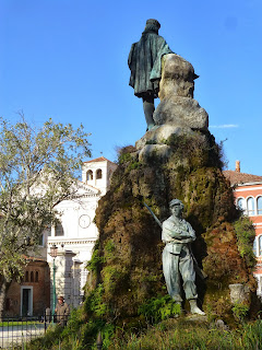
Back outside into the park and the views...


No comments:
Post a Comment