I had been meaning to visit the Design Museum for a while now. It's football exhibition gave me a good excuse!
The football exhibition is meant to show the influence of design on all matters football, from boots, balls and shirts, to stadia and games.
The two footballs used in the first World Cup Final in 1930. The two protagonists, Argentina and Uruguay were so distrustful of each other that they insisted on supplying their own balls and using one in each half.
The oldest table football game, astonishingly dating back to the 1880s
Now here is an interesting design archive - a series of calling cards left by rival hooligan gangs at the site of a successful scrap.
Photo of a proper football fan showing true allegiance to the colours - right down to the lawn mower😀
Model of the Sporting Braga stadium
Set of programmes from my club Coventry City dating to the 1970s. Design icons
Two Engand shirts. The one on the right from the 1950s is interesting as it is largely a button down shirt.
Geoff Hurst's 1966 boot, dipped in bronze
Obviously there are plenty of shirts on display....
And less obviously, some old seating. Does not look comfortable.
Three replica FA Cup trophies. The one in the middle is the well known men's FA Cup. But so is the one on the right. Just the predecessor to the current trophy.
As I say I had meant to visit the Design Museum itself, so now was an opportunity to see the permanent exhibits too. It is an interesting place, having formerly been the Commonwealth Institute (and it was that when last I visited). It is curious having a design museum in a building which frankly is so badly designed, but of course is of its era. As usual with avant garde buildings, the roof leaked, and what you really notice is how little exhibition space there really is. Lots of space, just not very usable. But the concrete shell is at least dramatic.
The first floor has an exhibition of sustainable, recycled clothing. Again a fine example of really bad design. It all looks utterly awful, and totally impractical for wearing. (Best example which I didn't photograph was a pair of massive thick woolen shorts which apart from looking absurd would always be too hot to wear at any time at which one might wear shorts.) Essentially it is all the sort of stuff that would only ever be worn once, at a fashion photo shoot. The complete antithesis of sustainability.
The top floor has the permanent collection and is quite good, but rather small. For design one would be better with the Victoria & Albert Museum (and I will be going there tomorrow!)
Really, for a design museum you want to see two things - how certain artefacts develop over time - and it does this in a number of cases, eg phones, computers, teapots, TV and stereos. Plus a look at specific designers and what makes them so good/iconic. But frankly there just isn't enough space, or enough exhibits, to really make for an engaging experience.
Paolozzi sculpture outside
And frankly, the outside isn't particularly remarkable.
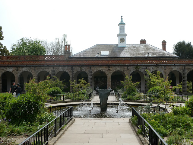
Holland House, which is a close neighbour, is rather more exciting.
And its gardens better still on a Spring day.
The Dutch garden. A must for tulip lovers.
Statue of Croton
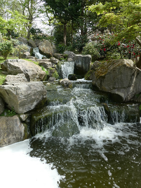
And the Kyoto Garden - beautiful Japanese garden.
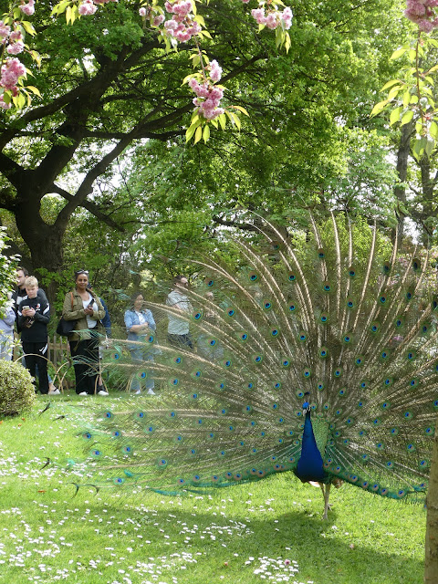
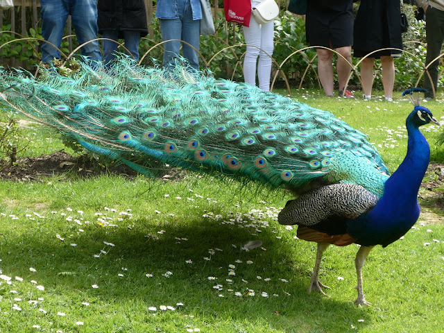
All set off by an appearance of the peacock.


No comments:
Post a Comment